


DM7910 S2 Project Portfolio including Outcomes
“Every goal we reach has once been part of a dream we thought would never come true.”
― Sandra Cooze
Aims of this proposal:
For the purposes of clarity the term App is my description of the delivery of my project to in AR for the consumer.
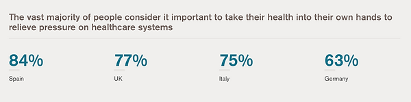
The project aim was an idea that can utilise the use of AR and VR technology. Through the course investigation of AR and VR and the uses of the technology that are more commonplace in all our lives. The rise of mobile phone usage during COVID and the impact of the pandemic on our online lives, gave me a strong point to start my enquiries. My idea was to use AR techniques to assist people in mental health issues, research by GSK (image below) illustrates the point that people were willing to provide themselves with self-care during the pandemic and ‘Save our NHS’ by staying safe impacted this new trend.
A year after the pandemic the UK has concerns regarding the impact on mental health, the enforced separation through three lock downs has taken its toll. AR and VR technology seem to be expanding at a rate in the medical sectors – especially for learning, this arena is well funded and I thought a useful place to start my investigation.
The project is an App to help an individual with anxiety and stress, the idea is to take the user away from their current situation by giving them choice about how they want to have time for themselves – self-care. Our emotions control how we react to our surroundings, so from this notion having AR interact with our landscape a sense of joy/interest/ discovery could be gained. The novelty of the interaction would provoke discussion about how people feeling.
Beginnings...
Through my coursework and research I looked to the beginnings of VR, those first machines filled a whole room with people connected to machinery – umbilical (A type of virtual reality that perhaps is what a foetus might experience in utero). I quickly found that the ideas of VR stem back as far as the documented thoughts of Plato. The Cave Analogy, is sighted as the first written account of a virtual reality experience to trick the mind and the eye that another narrative was occurring in the space or reality.
I began my research with a marketing plan, followed by a brand building document. Questioning why the App would be useful, and would it be possible in a market place. I saw this project as an opportunity to utilise UI and UX thinking. Basic SWOT analysis of the type of product gave me confidence to go deeper into the ideas. I research competitor Apps on the market (image below), and in what way, if any, they used AR or VR. I discovered one which used VR and AR called tryhealium.com

My App would be different to the Helium version as it would include all the senses, reading, listening, interacting and talking. I didn’t want the App to alienate people so I looked to the Learning styles that were identified in a 1992 study by Neil D. Fleming and Colleen E. Mills. They used the acronym ‘VARK’ to describe four modes of student learning. These different learning styles—visual, auditory, reading/writing and kinesthetic—were identified after thousands of hours of classroom observation. The authors created a questionnaire for teachers to give to students to help them identify and understand their own learning preferences. I have used this idea within my App so people can access information as they want to in a way that they want to.
Choice has a huge part to play in the user experience. Anxiety can be a varied from mild to severe, over thinking, worrying and finding it difficult to mentally move forward, can in its extreme, affect the physical being too. Being able to access a variety of methods to provide self checking, assistance or escapism could prove to be helpful.
The work of Martin Seligman in creating a theory of PERMA : Positive emotions, Engagement, Positive relationships, Meaning and Accomplishment for gaming. Seemed to fit the purpose and intention for my App, although not a game, the PERMA ideas were formed from the work of Abraham Maslow and gave me a reference back to his theory of the Hierachy of Needs. The App is concerned with emotional well being and self esteem it sits right at the top of the base needs, before someone can move forward into working on their growth needs.


Storytelling...
For the AR interaction to be successful a user needs to understand why they want or need the App as a tool, the process and research behind storytelling is an integral part of our shared human experience.
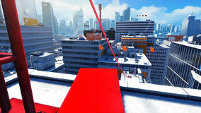
During the course we discussed the empowerment of a player in a game environment, escapism is the key as well as engagement. An example of AR/VR games was Mirrors Edge, where the free runner (your character) has to follow the line and make impossible jumps to get to the next level or complete the story. A critism of the game was you had to make quick choices in following the red objects, when these fall out of view, you are lost… placement of the AR in the game play was essential to user engagement and believability.
Storytelling lends itself in VR gaming environment to place yourself as first person, I have undertaken several tasks using unity design to simulate a game environment, to experiment and think about whether this format would be better than AR.


Scripting and build settings adding to scenes allowing us to swap between landscapes. We gave a box physical attribute we coded an action we made a new scene and button to connect two scenes coding in Sublime. (see below)


Robert Pratten (2015) speaks of storytelling - “As storytellers our job is to fire the imagination. We only need provide the audience with enough information to allow them to maintain their belief in the storyworld.” (p36) he also provide us with a diagram of 4 fundamentals to achieving a successful story: Space, Tactic, Goal, Narrative.
My control of the App space will be to lead the user through a journey, self discovery or self actualisation, to help them feel better, this is done through interactions with emojis, a selection of learning material to suit the user, to find out more about how they can feel better. I am getting the user to interact with video, music, reading or speak to professionals if they feel they need to. The goal in the App is to use it understand your emotions and leave the App feeling changed. The narrative in my App will be driven by content, AR resources to provide an experience within their surroundings providing further engagement.
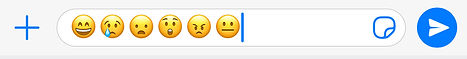
The emoji character made me look to our societal use of imagery to give hints or clues at how we are feeling, the rise of the emoji is the perfect example. Social media platforms and text speak has provided more ways to communicate, and with this language it has developed into a cultural expression. Scott Riley in his book ‘Mindful Design’, speaks of an Iconic Abstraction Scale and cites Scott McClouds work in Understanding Comics that “the more Iconic the image is without losing its meaning, the higher chance that we’ll apply it to some of our self” (Riley, S. 2019 .p34). Abstraction requires a collective memory of the item being referenced, the emotions and feelings are universal to humans.

The emoji concept became important to the App development as I required a way to measure the success of the interaction with the user. I developed the notion that using this simple dialogue tool I could gain quick feedback.
Our phone emoji’s of : Happy, Sad, Fear, Scared, Angry and Mixed emotions.
“It’s vitally important for the commercial success of a project that the marketing communications and customer feedback mechanisms are built into the storytelling and experience design because the audience avoids and mistrusts advertising. By adopting this entertainment-marketing duality, the audience will advocate on your behalf and share content because it meets their personal and social needs....” Robert Pratten (2015)
Other forms of psychological story telling...
Hypnosis is extremely useful to helping people with stress and anxiety, I discussed my ideas with Clare Rusby Prof. Dip Psy C. A practicing Hypnotherapy and Psychotherapist, we discussed the benefits of VR style interactions some people are not able to visualise the hypnosis script, this then takes a while to get into their healing process. If you are a visual person you would find it easier to access the unconscious mind.
An idea was that content in the App could be unlocked and delivered once a questionnaire has been completed, unlocking this powerful mind tool would need careful follow up. If the script could be represented visually then we concluded the use of AR with Hypnosis would be a powerful tool.
Medical research into mental health has shown that gaming can be a useful intervention and way to calm the mind, frustration and perseverance give a release to other tensions, “depressed mood has been found to be significantly lower in moderate players of video games compared to those who never play video games and those who play video games to excess” (pg2 Gaming well, Jones C et al 2014).
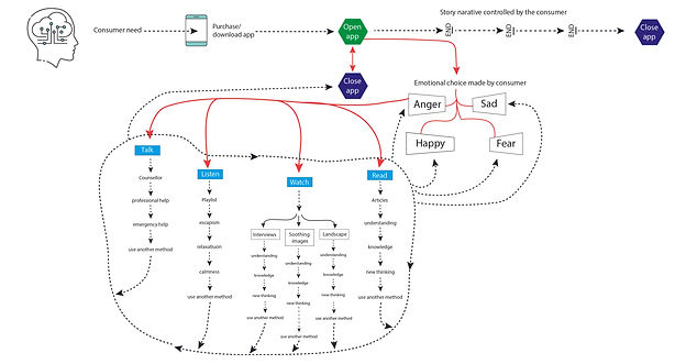
As you can see from the flow diagram, I tried to look at one area of the App interaction and using a flow diagram it very quickly this exploded into a web of actions and interactions. Following this user experience and retrieving data from this would be very interesting.
Brand development
Through my investigations I have developed a brand for the App design.
Below is the process of logo design.
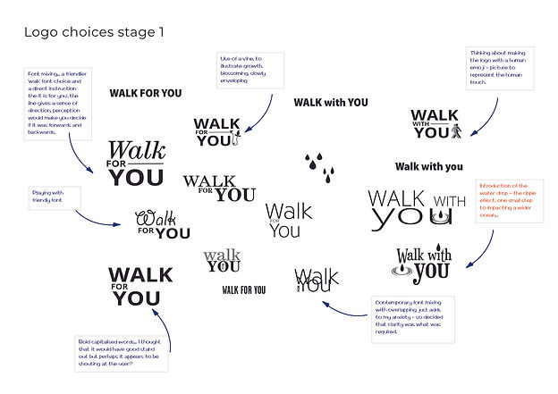
Stage 1 logo designs
The building of the brand was an integral part to the development of the App overall. To start with the logo was ‘Walk for You’ and another choice of ‘Walk with you’. I did a quick survey to help work out which name would be suitable I didn’t tell the participants much about the App just that it was for mental health.
Walk with You would have been Appropriate if full immersion in VR was to be undertaken, in my research I had dismissed VR as the development time would have been too long and the need for psychologist/therapist input would have been required, to make the App a safe space. (Kaplan, J,S. et al, 2011). Appendix 1: pg1 First brand survey.
The second survey on the name of the App: Time for You or Just for You, was successful in determining that Time for You was preferred by the participants. Appendix 2: pg1 second brand survey
Stage 2 logo designs:
I listened to the feedback and considered the change in name as the route of the App development had changed too.
Colour
The brand talks of emotions and feelings, I wanted the focus to be around how colours made people feel, I wanted to move away from the ‘go to’ colours that we normal choose for habitual reasons. The colours needed to be clear and fresh and not muddy.
Feelings and consumer reactions to them need to be considered I felt in there spectral form, especially through the research on colour theory. Sir Isaac Newton worked on the theory of Optic’s, a treatise of the reflections, refractions, inflections and colours of light... published in 1704 (Smithsonian library.ci.edu). Colour theory was subsequently challenged and By Wolfgang von Goethe as he annotated his work with the notion that there was an emotional connection to colours (Theory of colours in 1810).
The first look at brand colours were developed here:
The final choice of colours were selected through investigations of cultural norms and research into cross cultural associations of colour.

From the colour psychology chart I chose Happiness to be green as seen in the Hindu section of the wheel. Almost all cultures look at Red for Anger, I decided to go to the deeper orange red mix for the emoji choice. Unhappiness from the cultural wheel is blue and so I chose this for Sad, Yellow is for scared cowardice on the wheel.
I felt that Mixed emotions would be good to have on the selection area as we sometimes don’t feel all the emotions and feelings in one go, we might have part Anger and part Sadness for instance.
I made Fear more of a frozen colour, to be frozen in fear seemed to make sense. The NNGroup had four points when considering the Multicultural design process, Hierarchy, Proximity, Translation and Localisation. (Scahill Design Blog: S2 AR & VR Week 11)
Brand colours - Time for You:

Fountain of Knowledge
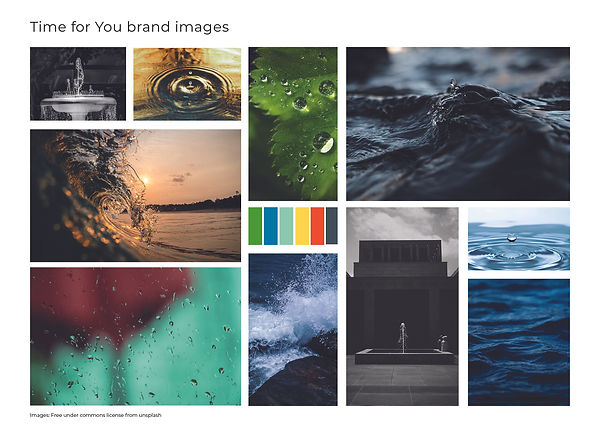
The brand idea was built around the ‘Fountain of knowledge’, a key part of the process and the AR function for people to access and begin their escape. Water can have so many ‘personalities’ and evoke feelings it tied the ideas together for a brand look.
Time for you brand photography:
The water drops designed for the Fountain of Knowledge allowed for choices to be made with a visual representation, of feelings not emotions:

Feelings and colours for user selection
I felt that people would identify with these words, then using the colour theory we could really get to ask people how they feel. Calm is green, Low is dark blue, Frozen is light green, Tense is yellow, Hot is orange, and Confused is charcoal.
I tested the colours on a small group, and the results were: 100% agreement with the colour choice of orange for anger and charcoal for confused. Yellow for tense scored the lowest, three quarters of people thought that green for calm, blue for low and light green for frozen were appropriate. Although there was a comment that the blue needed to be deeper, so I changed this in my design. Whilst I sought peoples opinion for the yellow colour, which is not our western cultural norm, everyone was happy accepting green for calm. Survey can be accessed below: (Appendix 4 : pg3 change the blue)
Links to water and fountains...
The first part of hypnosis script can talk of spaces such as meadows, beaches and water. Appendix 3 : pg2 Hypnotherapy script with a fountain. Hypnotherapy seems to use water as a metaphor and so this further validated my use of the Fountain of Knowledge to get the user to access the App.
An article by Molly McShane, talks of the benefits of guided imagery in healing,
“Our bodies react the same whether we are actually experiencing something or just imagining something. …Imagery has a positive effect on heart rate, blood pressure, breathing and oxygen rates, brain waves, temperature, and hormone balance.” (McShane, 2015). McShanes article gave me more confidence to use imagery, sounds and film to assist those with anxiety.
The brand has to develop and nurtured a consciousness. Its values, tone of voice and a personality resonate with the intended audience of the App, it distinguishes it from the competitors. The brand building document I created answered questions about the brand and who is needs to speak to: Appendix 5 : pg5 Brand building for Anxiety App
I experimented with the water drops and the fountain idea, and while the resolution needs to be adjusted the premise of the idea worked.

Here is the fountain of knowledge in an AR environment using Adobe Aero OUTSIDE

Here is the fountain of knowledge in an AR environment using Adobe Aero
INSIDE
Below are a couple of audio recordings I made for an acoustic experience.


Time for YOU Prototype
Adobe XD to make a prototype of the Time for YOU App. illustrating interaction, and how the AR and content pieces could work together.

Conclusion
I have built and described AR forms that I could use in my product, the Premier Pro films could be made into AR files and dropped into the space of the user, using a unity landscape. I have had to show them in Premier Pro as a prototype to the visual I would like to achieve.
I will need to develop the App further and run a testing cohort for the App’s content. There is a lot of background development that would need to be put into place, a database and perhaps a bot program. Content would need to be developed in line with practising psychologists to ensure integrity for each emotional pathway.
The App development has made me think about the importance of teaching. Shaping new ways of thinking through experiences like AR and VR interactions, delivers a layer of education in a tactile way.
Dreams made real and impossibilities made possible.
The content of this webpage is for my MA course in Digital Media Practice. All references can be found in the buttons at the top of the page. All design work is my own unless otherwise stated. JUNE 2021
If you have any questions please contact my scahilldesigner@gmail.com